Johan de Groot | Antichaos
Antichaos
Why is COUNTD so slow – and how can I fix this?
Calculations
,
Tableau
16 November 2025
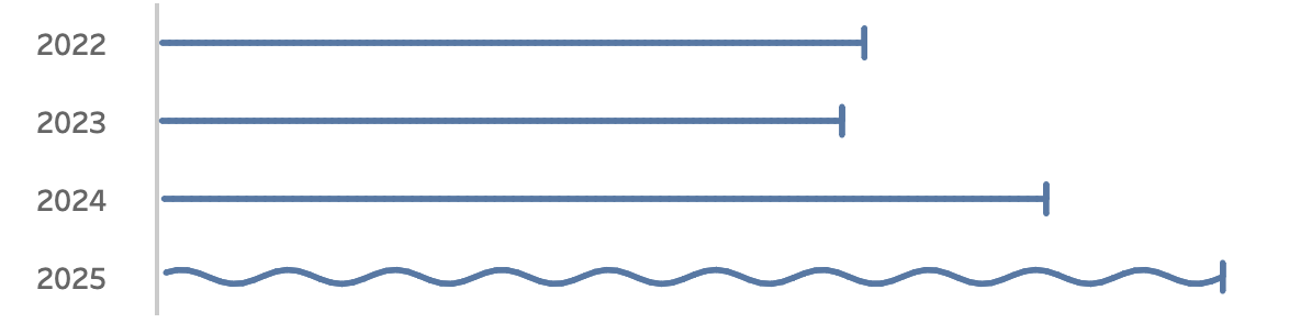
Visualizing ‘Dynamic’ Data using a Sine Wave
Tableau Desktop
,
Tableau Hacks
,
Tableau Server
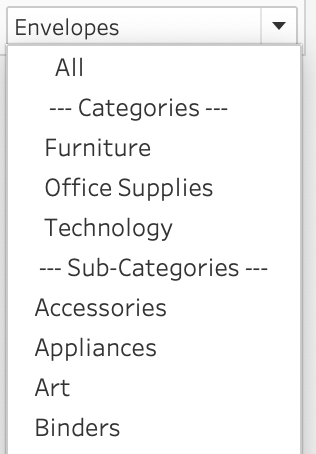
Add ‘All’ and more options to a Dynamic Parameter
Calculations
,
Parameters
,
Tableau Calculations
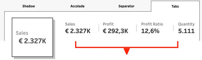
Tableau Container Art – 4 examples of formatting dashboards without images
Tableau
,
Tableau Desktop
,
Tableau Hacks
,
Visualisation
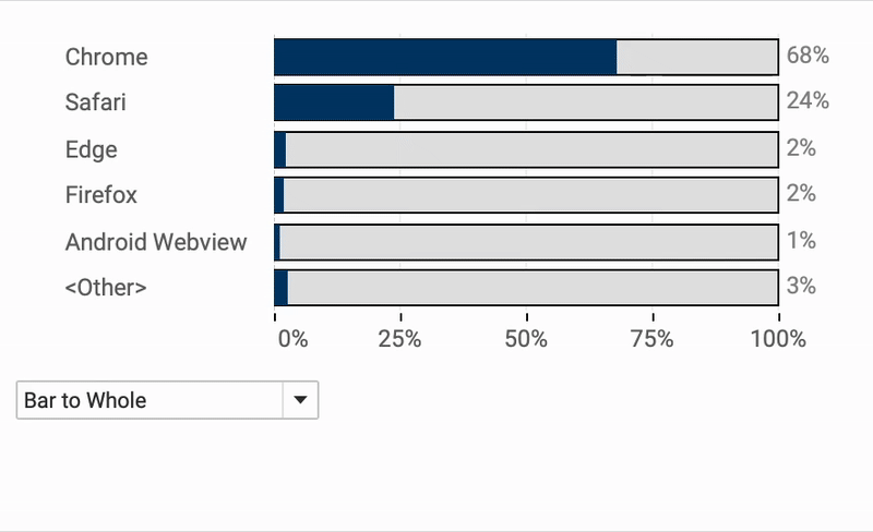
Letting Users Choose Their Visual
Calculations
,
Formatting
,
Tableau
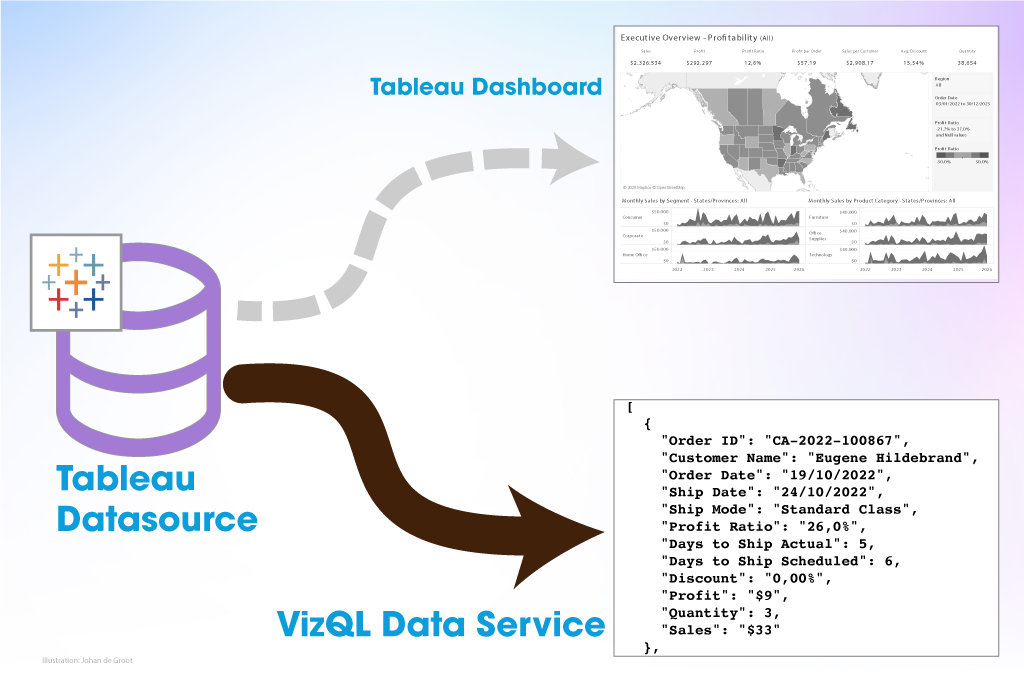
The Tableau VizQL Data Service: What It Is, What It Can Do, and When to Use It
API
,
Tableau
,
VizQL Data Service
More blog posts
Abbreviate long text in Tableau
19 June 2025
Two Pie Chart Alternatives
12 June 2025
The Case for Clearer Parameter Labels in Tableau
5 June 2025
Show/Hide – but better
29 May 2025
Responsive Labels – Smarter, Cleaner Dashboards
22 May 2025
Area Funnel chart in Tableau: Visualizing the Drop-Off
15 May 2025