It’s that time of year again… – the Visualisation of the Top 2000 of Radio 2!
One of my traditions is to visualize the Top 2000 as being broadcasting by the Dutch radio station Radio 2 using Tableau.
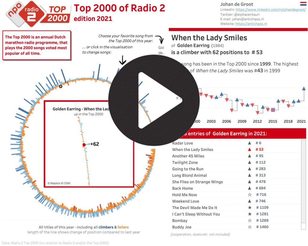
This time I choose a circular visualisation of the list, with a detailed/zoomed-in look at the chose title inside the circle. Changing a title can be done via the drop-down, but also by clicking in the circle (either one) or in the list of entries of the artist.
Used Tableau techniques are – among others – Map Layers, parameter actions, Level of Detail calculations and a little bit of Tableau Prep.
Biggest challenges of this dataset are – like each year:
- getting the data
- cleaning the data
but also:
- how to visualize a ranking list (best on #1, but ‘capped’ on 2000 entries each year)
- how to make sure all the names of both artists and titles are being showed correctly, independent of the length of these?
- what is the correct way to get a circular visualisation with these pesky sine, cosine and angle…
and – a small pet-peeve of mine:
- can you make the used texts dynamically to make sure they don’t look too automated?