Tag: tableau
-
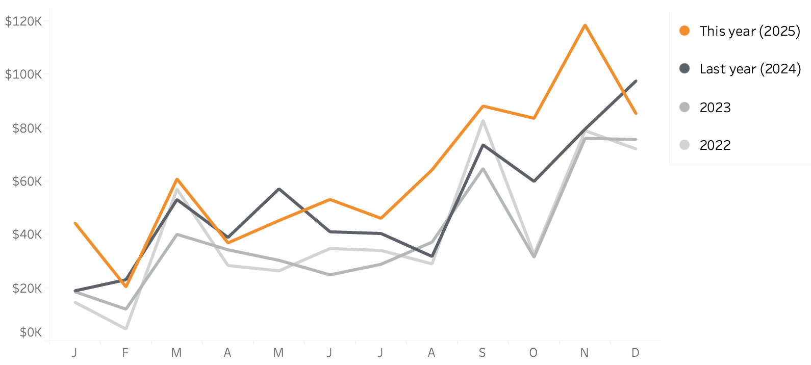
Line-chart: betters ways to compare years
Line charts are one of the best and popular ways to show how data has developed over time. It’s a simple graph that is familiar to anyone, but the default generated can often be improved – either in Tableau, Excel or any other tool. In this blog post I want to show how a relative…
Written by