Tag: Presentation
-
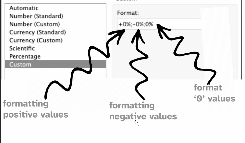
Improve layout of percentags – Better labels in Tableau
Often improving a dashboard is about small changes. Have a look a this chart: [This blogpost is part of a series tips tricks, as being presented at VizIt Berlin 2023]
Written by
-
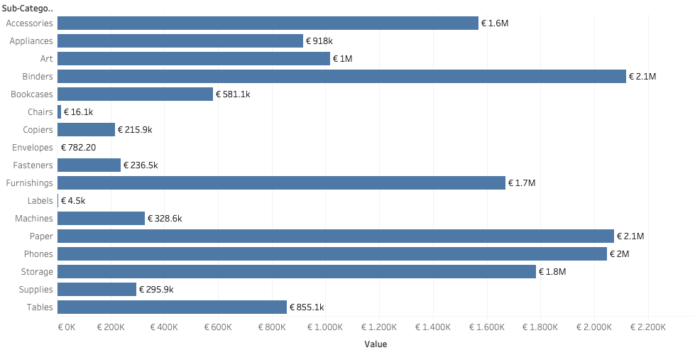
Dynamic value format – Better labels in Tableau
Labels are often an after-thought for many users – we don’t like them, but are necessary. Using some simple steps we can create better labels which are easier to interpret for the users of the dashboard. [This blogpost is part of a series tips tricks, as being presented at VizIt Berlin 2023]
Written by