Category: Visualisation
-
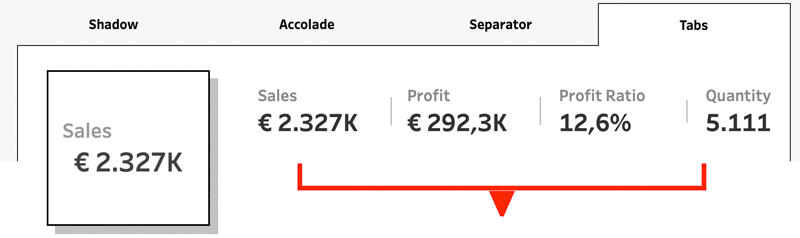
Tableau Container Art – 4 examples of formatting dashboards without images
Tableau containers don’t exactly have the best reputation. Most people either ignore them or wrestle with them. But once you actually get along with containers (and their friends: borders, background colors, and padding), they turn into your dashboard’s interior designers. In this post, I’ll show you four small but powerful ways to use the Tableau…
Written by
-
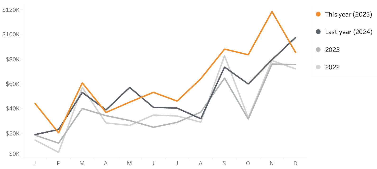
Line-chart: betters ways to compare years
Line charts are one of the best and popular ways to show how data has developed over time. It’s a simple graph that is familiar to anyone, but the default generated can often be improved – either in Tableau, Excel or any other tool. In this blog post I want to show how a relative…
Written by
-
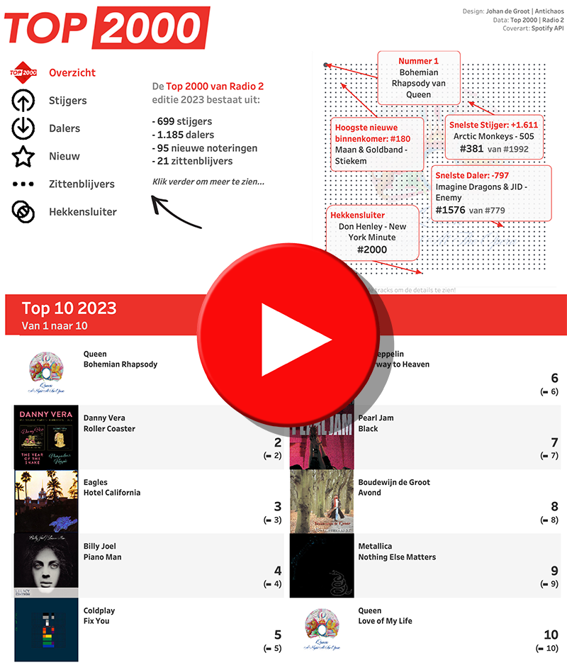
Top 2000 of 2023 – what stood out?
The Top 2000 of Radio 2 (a populair Dutch radio station) has been broadcast for the 25th time – and traditionally I am trying to turn this into a ‘different’ interactive data visualization…
Written by