Category: Tableau Server
-
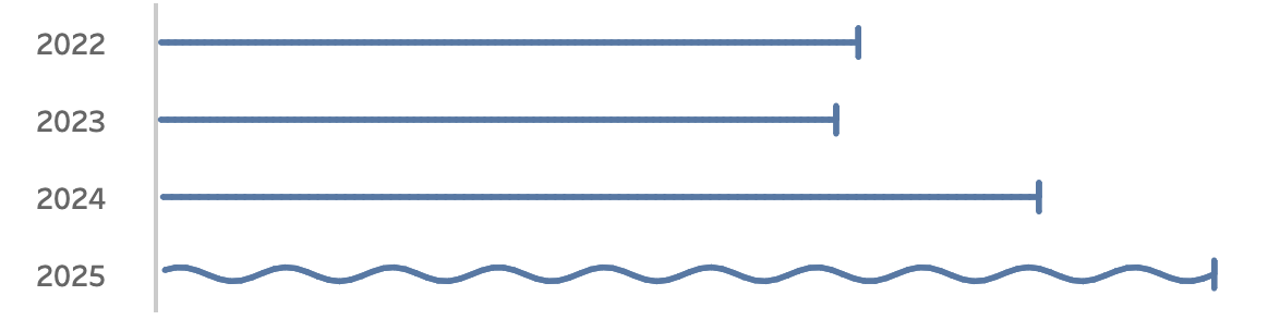
Visualizing ‘Dynamic’ Data using a Sine Wave
Recently I ran into a small but surprisingly tricky problem: how do you visualize something that’s in progress? A standard bar chart works usually perfectly for completed values, but what about the final bar isn’t finished yet because e.g. the year isn’t finished yet, Fading it out, changing the shape or adding a label like…
Written by
-
Show/Hide – but better
The default Show/Hide button in Tableau offers a quick way to toggle dashboard elements, but it comes with limitations—especially when dealing with larger components like full-screen visualizations or help panels that can obscure the toggle itself. In this guide, I show a smarter approach using Dynamic Zone Visibility and Parameter Actions. By setting up separate…
Written by
-
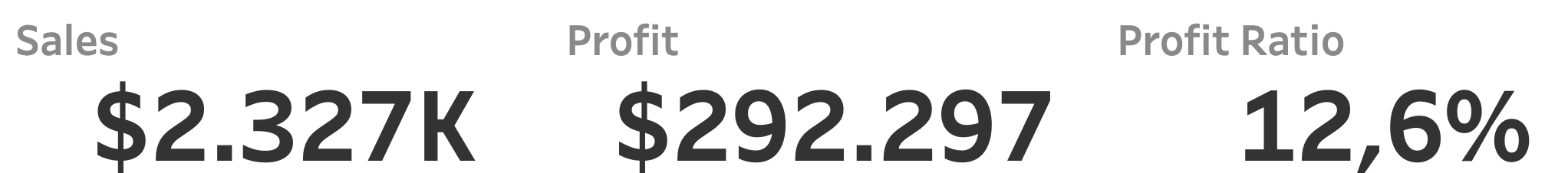
Clean your BANs – 3 simple tips
Three easy to implement tips on BANs: the Big Ass Numbers you put on top of your dashboard. BANs are a common and good way to display important figures. But while they are seemingly easy to implement, often they can be improved to make them more effective. [part of the ‘Datafam London 2024 – Deepcleaning…
Written by