Category: Tableau Desktop
-
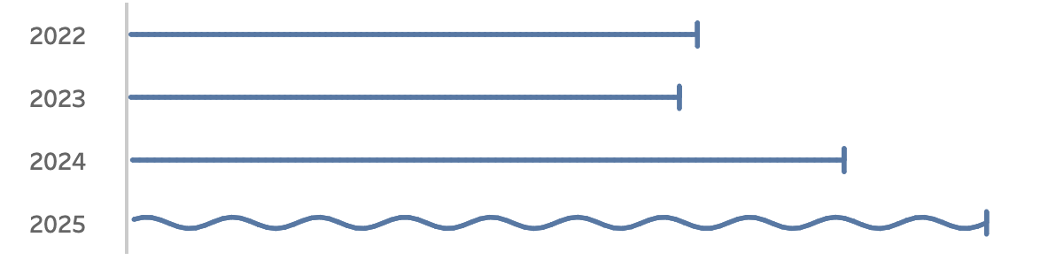
Visualizing ‘Dynamic’ Data using a Sine Wave
Recently I ran into a small but surprisingly tricky problem: how do you visualize something that’s in progress? A standard bar chart works usually perfectly for completed values, but what about the final bar isn’t finished yet because e.g. the year isn’t finished yet, Fading it out, changing the shape or adding a label like…
Written by
-
Show/Hide – but better
The default Show/Hide button in Tableau offers a quick way to toggle dashboard elements, but it comes with limitations—especially when dealing with larger components like full-screen visualizations or help panels that can obscure the toggle itself. In this guide, I show a smarter approach using Dynamic Zone Visibility and Parameter Actions. By setting up separate…
Written by
-
5 Tableau Desktop Tips
Tableau is packed with small but powerful features that can make your workflow smoother and more efficient. However, some of these tricks aren’t immediately obvious—even for experienced users.
Written by
-
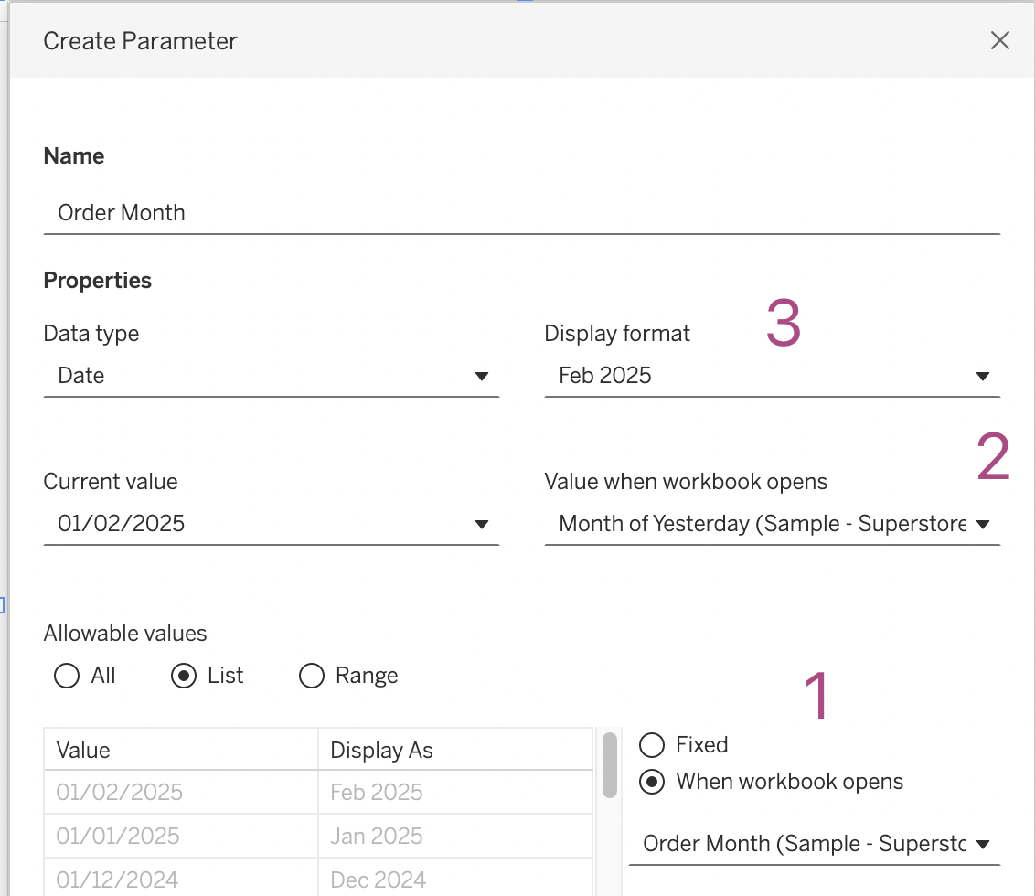
Easier date drop-down in Tableau
This small tip is on how to add a filter to a dashboard with the current month on top, so it is easier to navigate for users. Not one which will drastically change your dashboard, but a ‘quality of life’ usability tip.
Written by
-
A better date-filter in Tableau
When building a dashboard, one of the most common elements is a date-filter. And the most used date filter is probably the infamous ‘Range of Dates’.
Written by

-
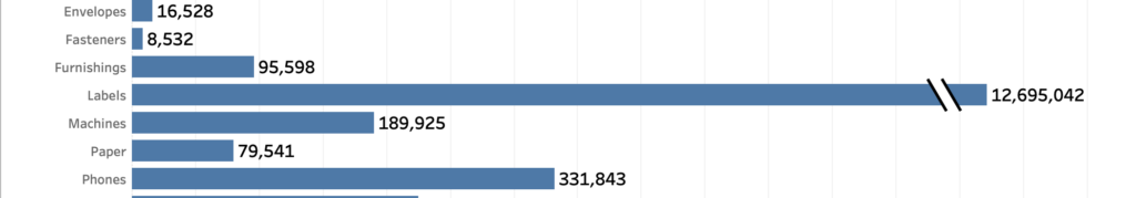
How to visualize extreme values?
Now and then you encounter data with ‘extreme values’. Values which are much larger than the other ones – and so hard to analyse. A dataset which is skewed like that needs to have a special treatment when visualized, because otherwise the individual values can’t be identified correctly.
Written by