Category: Tableau
-
DataFam 2024 – London
On the 11th and 12th of November of this year a complete new Tableau event was held in the center of London: DataFam 2024.
Written by

-
Change all colors at once
One of the most impactful development tips I got during TC24 was a very small one, but I have used it a lot since then. What is you have just finished your dashboard, and your manager/client/voice in you head tells you: I think the color of the charts need to be changed to pink…
Written by
-
A better date-filter in Tableau
When building a dashboard, one of the most common elements is a date-filter. And the most used date filter is probably the infamous ‘Range of Dates’.
Written by

-
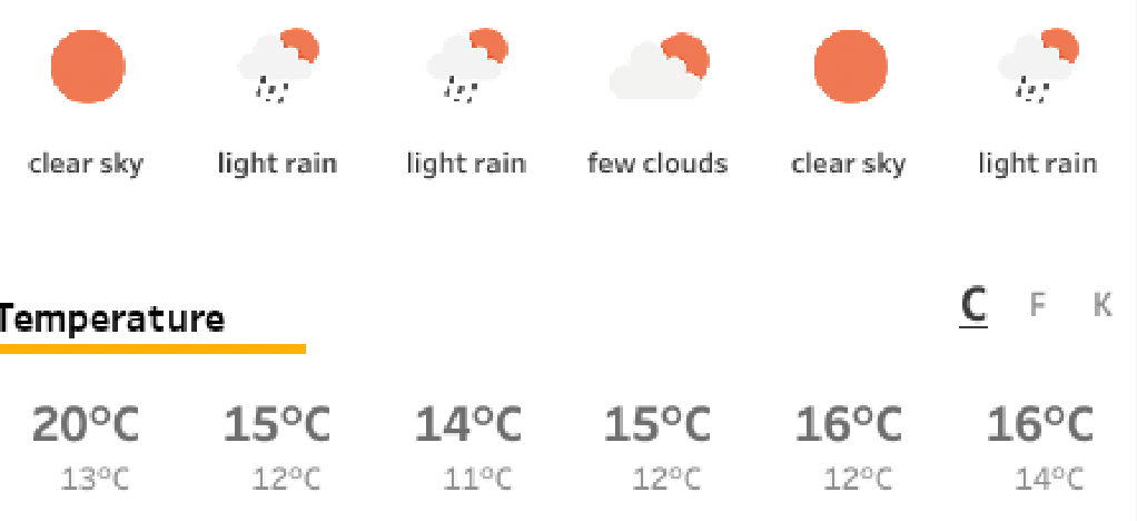
Weather Forecast dashboard in Tableau
It’s just a couple of weeks before TC24 in San Diego… So we want to know what the weather is out there! Or at home. Or any other place in the world. What better than building your own weather forecast in Tableau!?
Written by
-
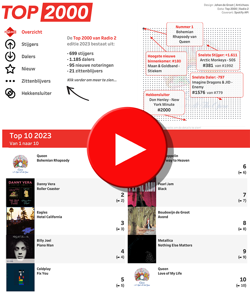
Top 2000 of 2023 – what stood out?
The Top 2000 of Radio 2 (a populair Dutch radio station) has been broadcast for the 25th time – and traditionally I am trying to turn this into a ‘different’ interactive data visualization…
Written by
-
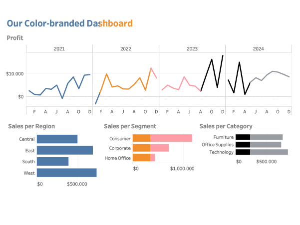
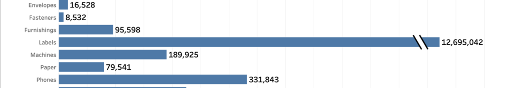
How to visualize extreme values?
Now and then you encounter data with ‘extreme values’. Values which are much larger than the other ones – and so hard to analyse. A dataset which is skewed like that needs to have a special treatment when visualized, because otherwise the individual values can’t be identified correctly.
Written by
-
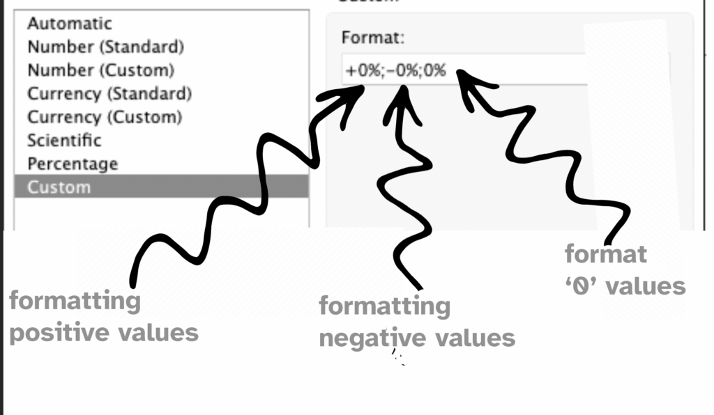
Improve layout of percentags – Better labels in Tableau
Often improving a dashboard is about small changes. Have a look a this chart: [This blogpost is part of a series tips tricks, as being presented at VizIt Berlin 2023]
Written by