Category: Tableau
-
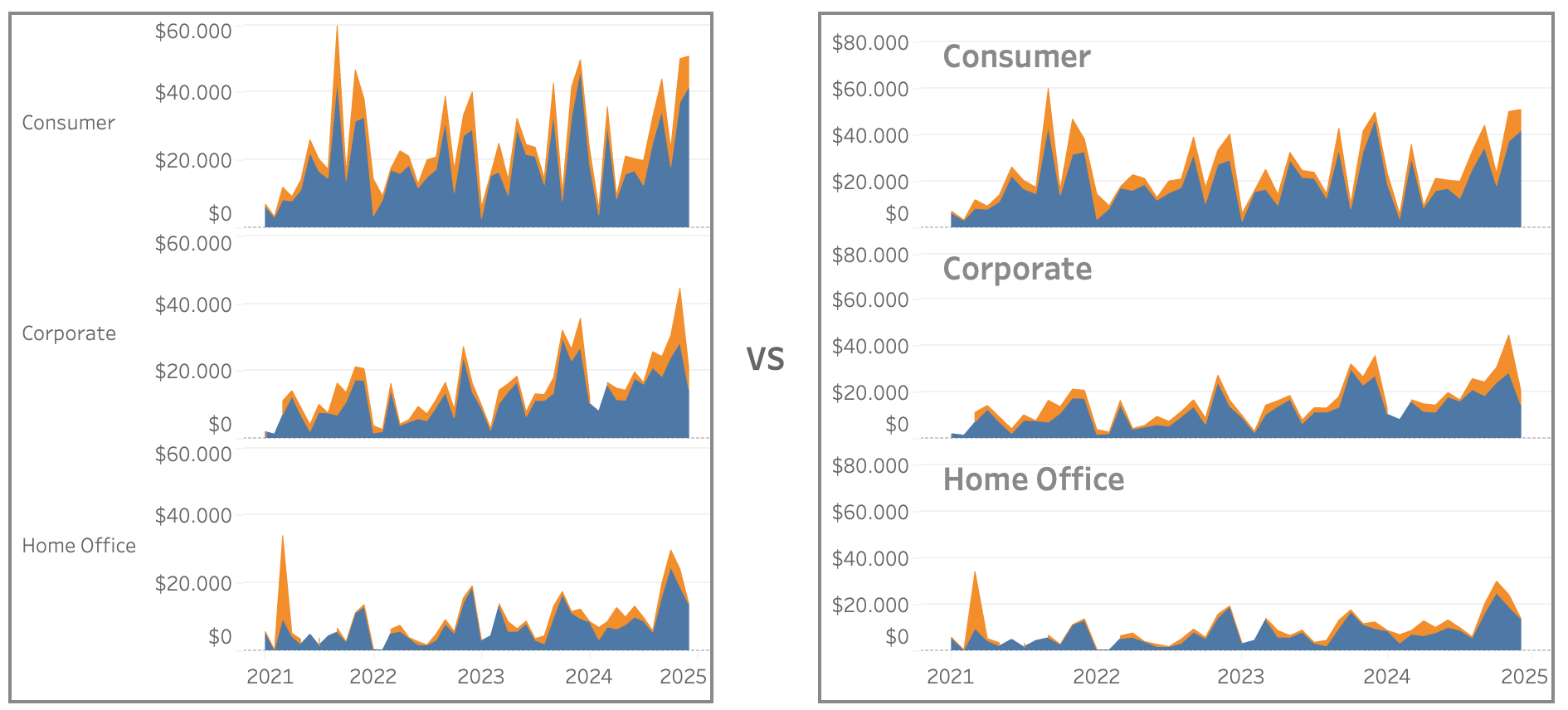
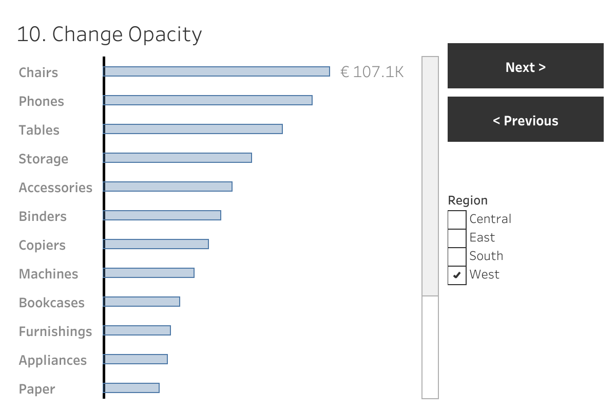
Improve Titles on Small Multiples
Small multiples charts (also known as trellis charts or panel charts) are a great way to visualize trends across different categories while maintaining consistency. They display multiple variations of the same chart, often sharing a common axis, which allows for easier comparison across groups. While effective, these charts can suffer from poor readability if titles…
Written by
-
Easier date drop-down in Tableau
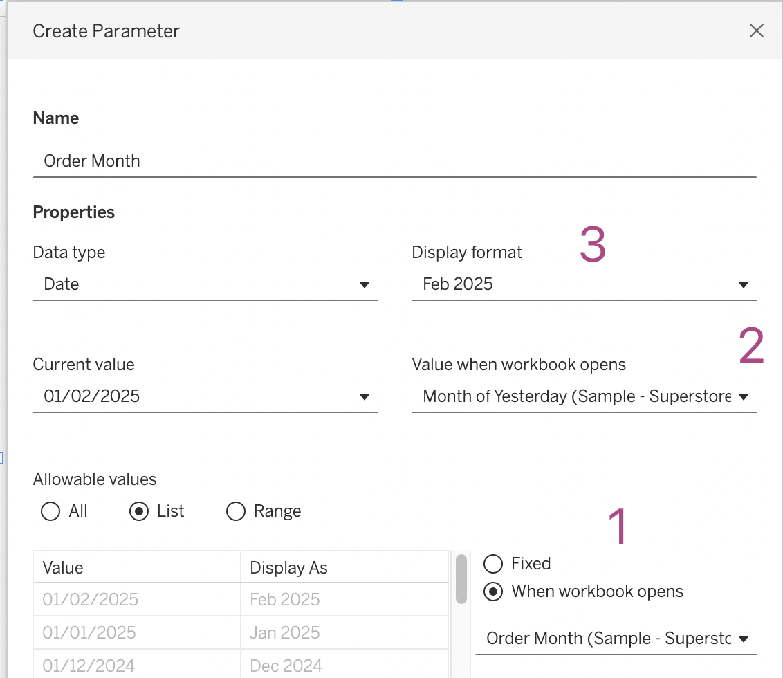
This small tip is on how to add a filter to a dashboard with the current month on top, so it is easier to navigate for users. Not one which will drastically change your dashboard, but a ‘quality of life’ usability tip.
Written by
-
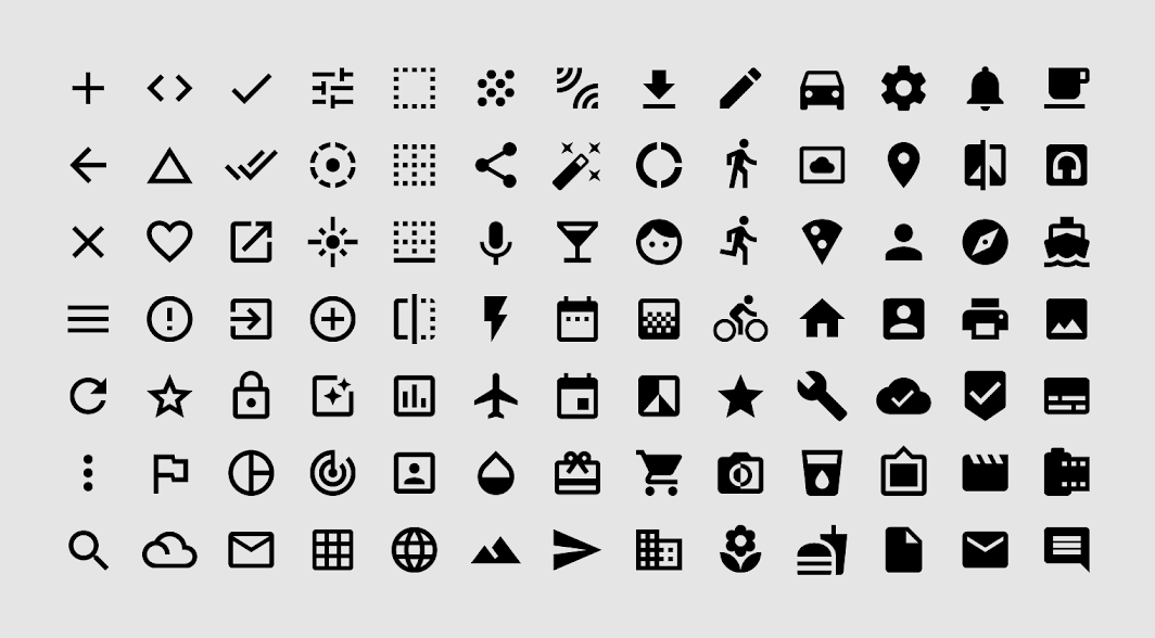
Deep Cleaning: Icons
Using the right visuals (images) on a dashboard is very important. Icons are often used go guide users into the right direction, so we don’t want to confuse them with unclear images [part of the ‘Datafam London 2024 – Deepcleaning your dashboard’ series]
Written by
-
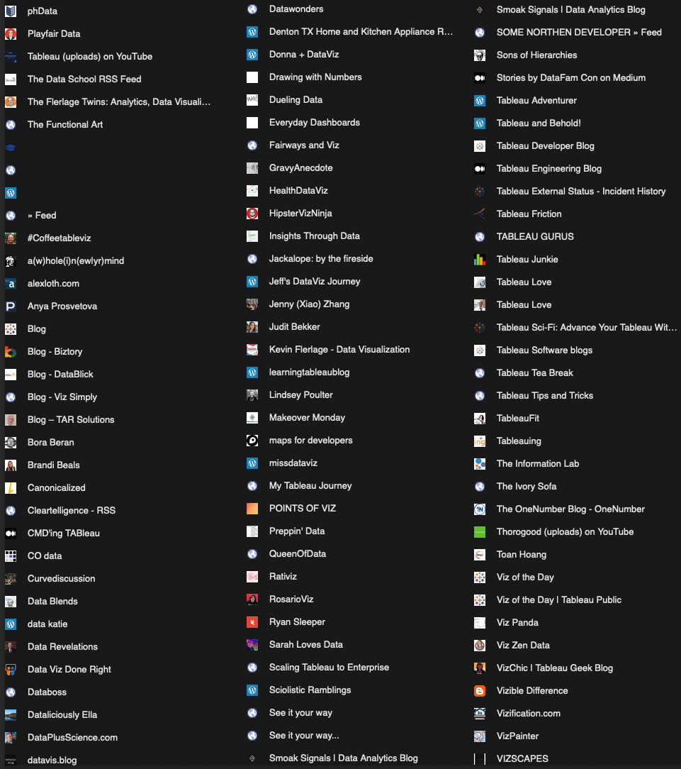
My Tableau Resources
During my Datafam London presentation I briefly showed a slide with a screenshot of my RSS reader – my main source of inspiration on everything Tableau. Afterwards I have got several requests to share this list of website. Every time I stumble upon an interesting blog (or website with a feed) I add it to…
Written by
-
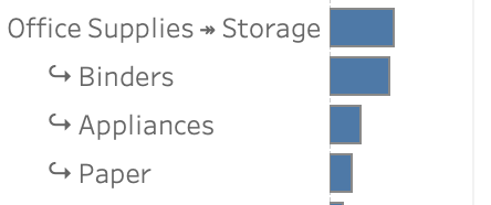
Drill Down in Tight Spaces
A different way to make drill down possible/usable in a small sheet. Sometimes you don’t have all the space to do what you want. Or you are almost finished with a dashboard, and suddenly someone mentions: “Wouldn’t it be nice if we could drill down on this chart…” – but the sheet is just too…
Written by
-
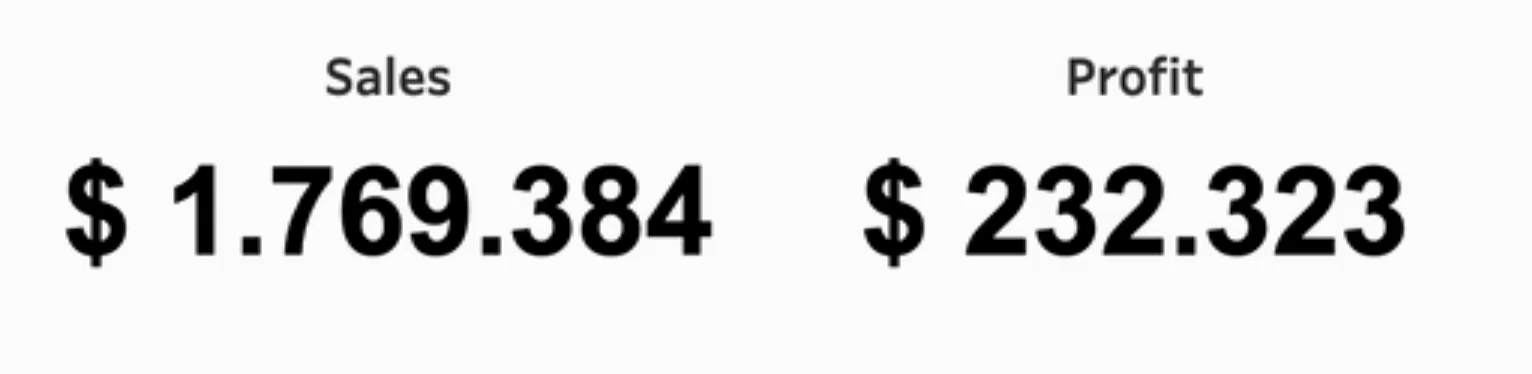
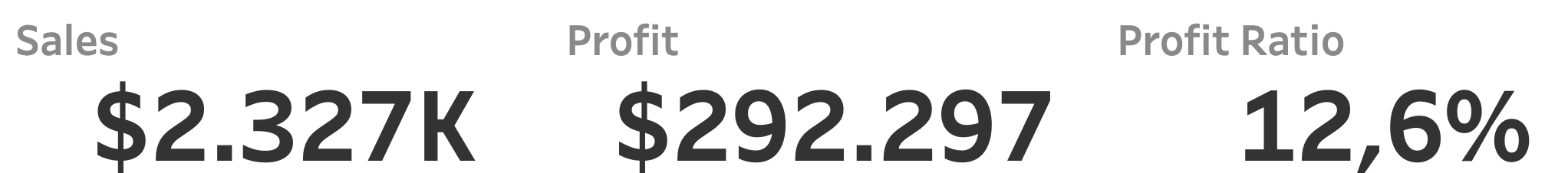
Clean your BANs – 3 simple tips
Three easy to implement tips on BANs: the Big Ass Numbers you put on top of your dashboard. BANs are a common and good way to display important figures. But while they are seemingly easy to implement, often they can be improved to make them more effective. [part of the ‘Datafam London 2024 – Deepcleaning…
Written by
-
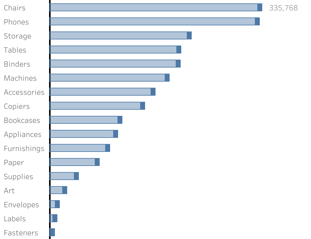
Deep Cleaning Barcharts – part 2: Punctuated Bar Chart
[part of the ‘Datafam London 2024 series] In part 1 we took a look at a basic bar chart, and ended with the lollypop chart. A fun chart with one major issue: the dot obfuscates the real datapoint. Punctuated Bar Chart One solution for it the Punctuated Bar Chart:We highlight the end of each bar,…
Written by
-
Deep Cleaning Barcharts – part 1: the basics
[part of the ‘Datafam London 2024 series] On DataFam 2024 in London I gave a presentation / workshop on deep cleaning dashboards. Why cleaning dashboards? Dashboard cleaning is about: Removing, adding , re-arranging, and replacing stuff. In Tableau, it’s about: Table calculations, extra sheets, changing images, talking to users, being critical to yourself, … Is…
Written by
-
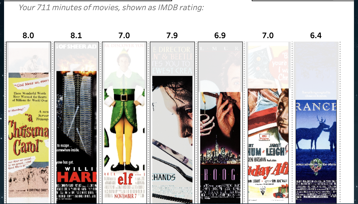
Christmas Movie Marathon using a Image based bar-chart
You can use to create your own Christmas Movie Marathon in Tableau using this dashboard! Based on the IMDB dataset ‘100 best Christmas movies of all time’ and some nice Tableau techniques you can determine which movies you want to watch this holiday. Start by entering the time you can spend on movies this holiday…
Written by
-
Tableau ‘CountTo’ Extension
Ever wanted to count up or down in Tableau?Now you can using the CountTo Viz Extension – for free! Using this extension a dashboard will count up or down to a certain value.
Written by