Category: Tableau
-
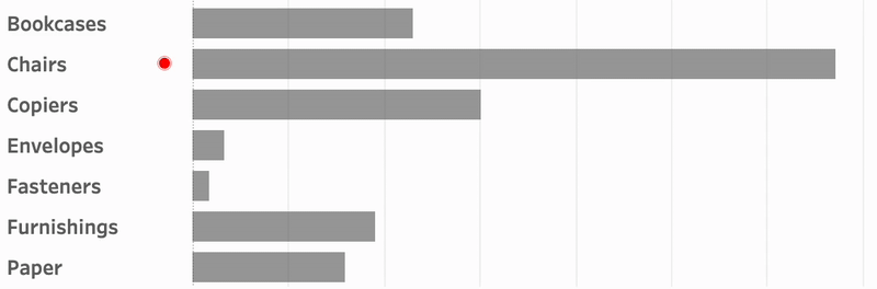
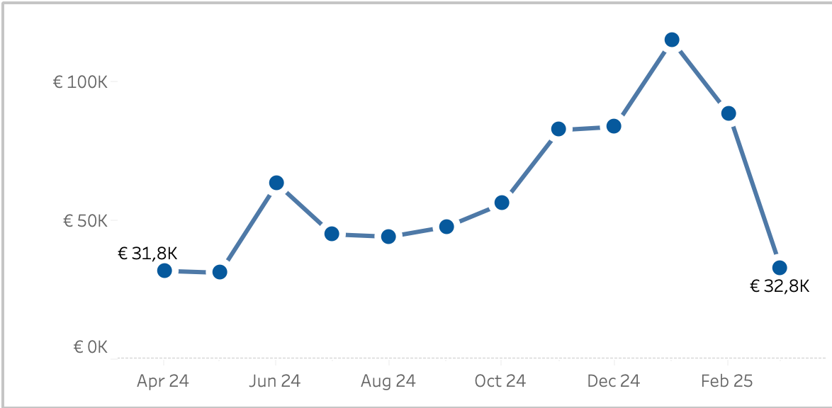
Responsive Labels – Smarter, Cleaner Dashboards
Data Visualization is about visualizing data the right way. Interactive business dashboards tend to have a special challenge: the must display data with accurate labels, regardless of how the data changes from day to day. Many infographics visualizations are using static data – and therefor the labels can be put on the most convenient location.…
Written by
-
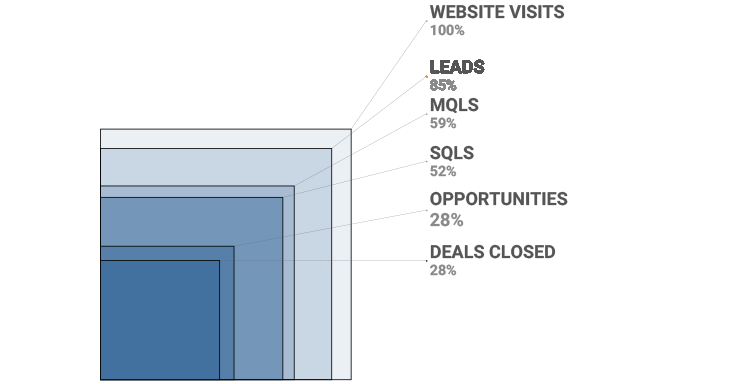
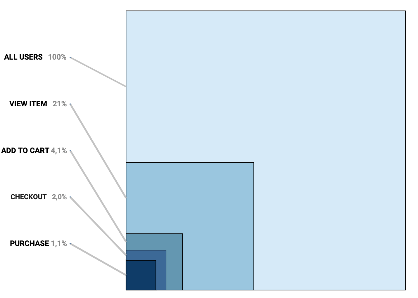
Area Funnel chart in Tableau: Visualizing the Drop-Off
In the world of digital analytics and customer journeys, not every user makes it to the finish line. Some browse a product, others add it to their cart, but only a fraction complete a purchase. Understanding where users drop off—and how many—can offer crucial insights for optimizing your process. That’s where funnel visualizations come in.…
Written by
-
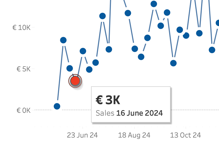
Change marks on Hover
Sometime you want to make a dramatic statement – and sometimes you just need a little nudge to help users understand a dashboard. Tableau makes it really easy to create a minimalist dashboard – and tooltips are a great way to unlock the data behind a mark. Emphasizing the datapoint of the tooltip will make…
Written by
-
Animated icons in Tableau
An old but very efficient way to point the attention to a row in a table is to add a small text-based icon in front of it. A subtle dot in front of a bar can help you tell the story of data.But you might want to use less-subtle ways to highlight data? Animation is…
Written by
-
API to Tableau, the Smart Way: A Guide to Table Extensions
Getting data from external APIs into Tableau often involves several workarounds —manual extracts, middle-ware scripts, or writing to a database. This isn’t bad per se, but if you just want real time data from an API, Table Extensions are a clean and direct solution. Table Extensions allow you to connect Tableau directly to external data…
Written by

-
Easy Custom Formatting in Tableau
Formatting matters. Inconsistent formatting in your Tableau visualizations can will confuse your audience and make your dashboard look unpolished. A well-structured dashboard is not just about the right data—it’s about making that data easy to read and interpret. Inconsistent date formats, poorly formatted numbers, percentages, and currency values can make your insights less clear. Especially…
Written by
-
5 Tableau Desktop Tips
Tableau is packed with small but powerful features that can make your workflow smoother and more efficient. However, some of these tricks aren’t immediately obvious—even for experienced users.
Written by

-
Extract custom shapes from Tableau workbook
Ever got a Tableau workbook with shapes you want to re-use, but weren’t able to because you didn’t have the original files? You can extract the files from the workbook! Either by hand opening the source code, or using my small Python script.
Written by
-
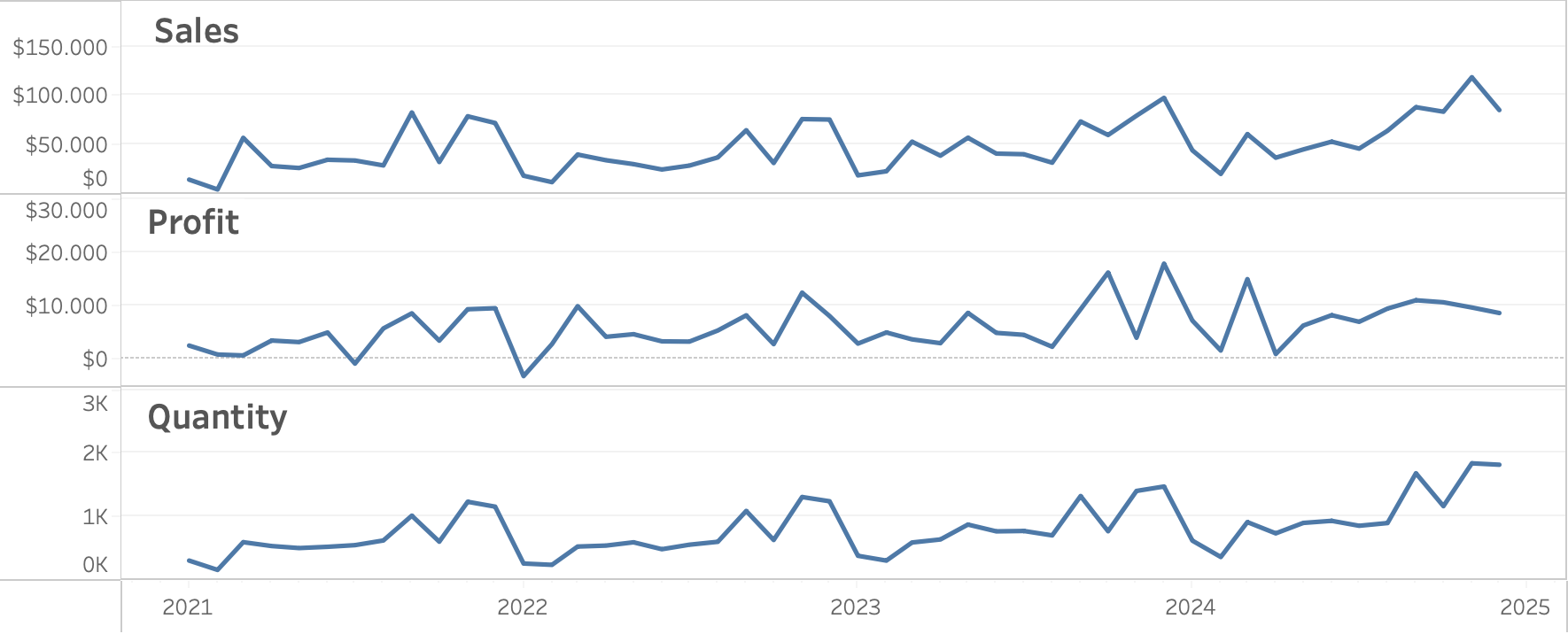
Better Line-charts
In the endless pursuit of creating better charts, let’s look at the line-chart. Probably the most used chart of all times, since it often shows a metric (sales, quantity, temperature, …) over time. I already discussed focusing on what is important in the article on “betters ways to compare years“. But how can we improve…
Written by
-
Better Titles on Multiple Measure Panes
Similar to titles on small multiples, showing title only in the axis on multiple-measure charts is not user friendly. The visuals distance between title and the data is too large, and vertical text is never easy to read: Let’s look at an easy ways to enhance the labels for better clarity and user experience. [part…
Written by