Category: Calculations
-
Why is COUNTD so slow – and how can I fix this?
When you start tuning a Tableau dashboard or SQL query for performance, one thing jumps out quickly: COUNTD can slow things down. The count-distinct is an extremely useful function which looks simple on the surface, but under the hood it forces the engine to do extra work that adds up fast. Understanding why this happens…
Written by
-
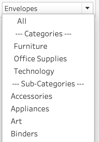
Add ‘All’ and more options to a Dynamic Parameter
A couple of years ago, Tableau introduced one of its most highly requested features ever: Dynamic Parameters. This feature made it possible to populate a parameter with values directly from a data source, rather than being limited to static, manually entered values. This works great, but as soon as this was available a new request…
Written by
-
Letting Users Choose Their Visual
A powerful way of creating flexible, user-friendly dashboards is by letting your users decide how they want to view the data. Instead of forcing them to view at a certain chart type, you can give them the option to chose between different visualizations- bar charts, line charts, etc, or variations on a chart, based on…
Written by
-
Responsive Labels – Smarter, Cleaner Dashboards
Data Visualization is about visualizing data the right way. Interactive business dashboards tend to have a special challenge: the must display data with accurate labels, regardless of how the data changes from day to day. Many infographics visualizations are using static data – and therefor the labels can be put on the most convenient location.…
Written by
-
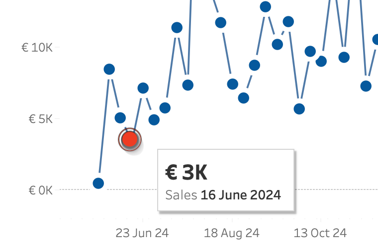
Change marks on Hover
Sometime you want to make a dramatic statement – and sometimes you just need a little nudge to help users understand a dashboard. Tableau makes it really easy to create a minimalist dashboard – and tooltips are a great way to unlock the data behind a mark. Emphasizing the datapoint of the tooltip will make…
Written by
-
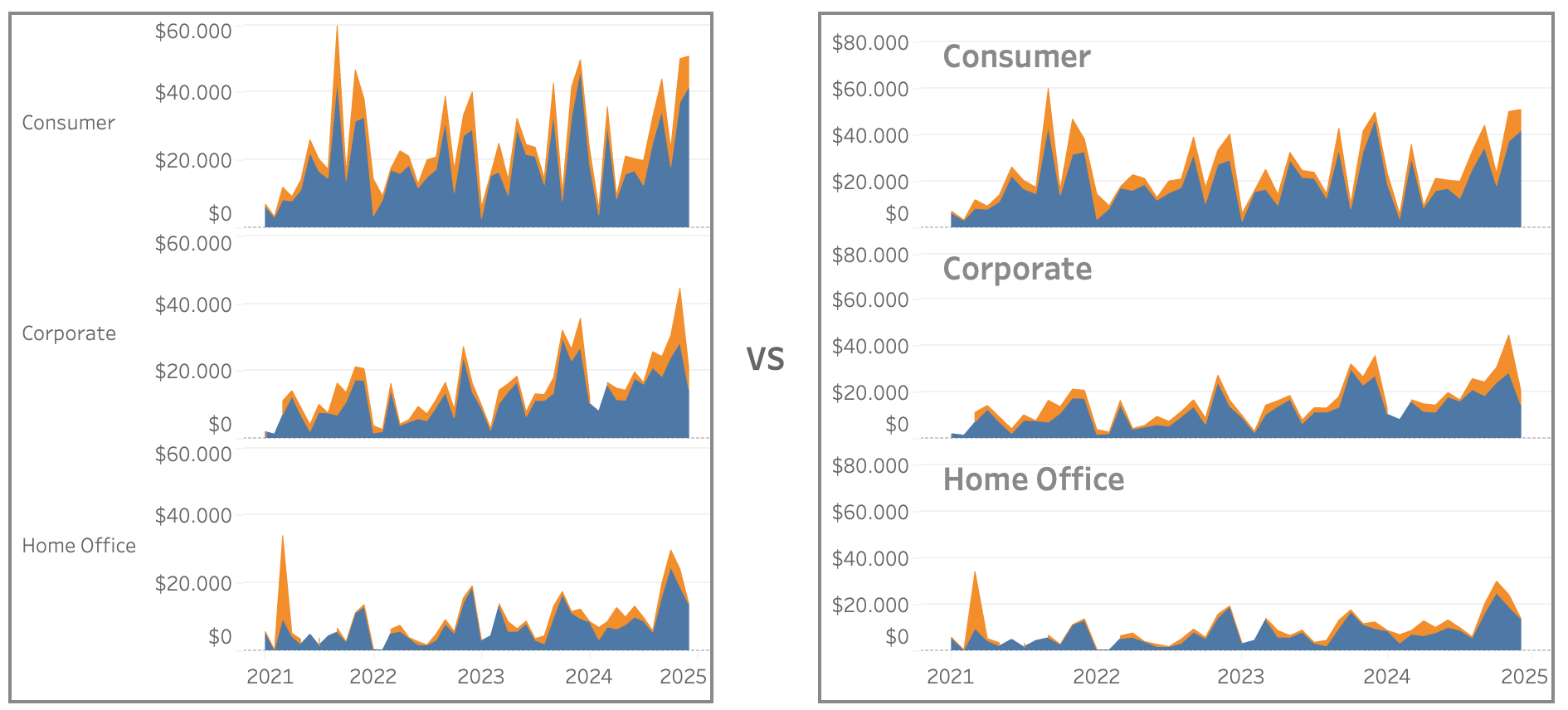
Improve Titles on Small Multiples
Small multiples charts (also known as trellis charts or panel charts) are a great way to visualize trends across different categories while maintaining consistency. They display multiple variations of the same chart, often sharing a common axis, which allows for easier comparison across groups. While effective, these charts can suffer from poor readability if titles…
Written by
-
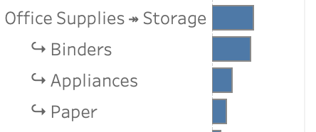
Drill Down in Tight Spaces
A different way to make drill down possible/usable in a small sheet. Sometimes you don’t have all the space to do what you want. Or you are almost finished with a dashboard, and suddenly someone mentions: “Wouldn’t it be nice if we could drill down on this chart…” – but the sheet is just too…
Written by
-
Better datefilters in Tableau
Datefilters are one of the most common filters on any dashboard. They are needed to see trends, make decisions on the right period, and analyse within the right context. But most of the times these filters are not optimal – so let’s make them better (and prettier)
Written by
