Category: Tableau
-
Why is COUNTD so slow – and how can I fix this?
When you start tuning a Tableau dashboard or SQL query for performance, one thing jumps out quickly: COUNTD can slow things down. The count-distinct is an extremely useful function which looks simple on the surface, but under the hood it forces the engine to do extra work that adds up fast. Understanding why this happens…
Written by
-
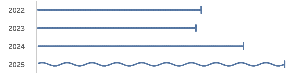
Visualizing ‘Dynamic’ Data using a Sine Wave
Recently I ran into a small but surprisingly tricky problem: how do you visualize something that’s in progress? A standard bar chart works usually perfectly for completed values, but what about the final bar isn’t finished yet because e.g. the year isn’t finished yet, Fading it out, changing the shape or adding a label like…
Written by
-
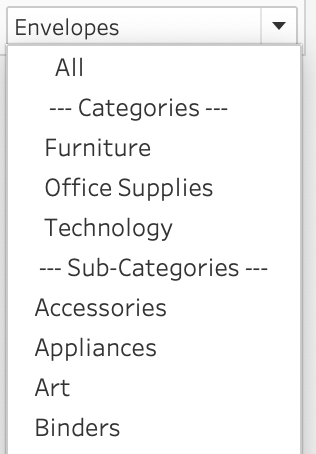
Add ‘All’ and more options to a Dynamic Parameter
A couple of years ago, Tableau introduced one of its most highly requested features ever: Dynamic Parameters. This feature made it possible to populate a parameter with values directly from a data source, rather than being limited to static, manually entered values. This works great, but as soon as this was available a new request…
Written by
-
Tableau Container Art – 4 examples of formatting dashboards without images
Tableau containers don’t exactly have the best reputation. Most people either ignore them or wrestle with them. But once you actually get along with containers (and their friends: borders, background colors, and padding), they turn into your dashboard’s interior designers. In this post, I’ll show you four small but powerful ways to use the Tableau…
Written by
-
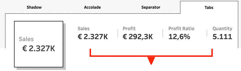
Letting Users Choose Their Visual
A powerful way of creating flexible, user-friendly dashboards is by letting your users decide how they want to view the data. Instead of forcing them to view at a certain chart type, you can give them the option to chose between different visualizations- bar charts, line charts, etc, or variations on a chart, based on…
Written by
-
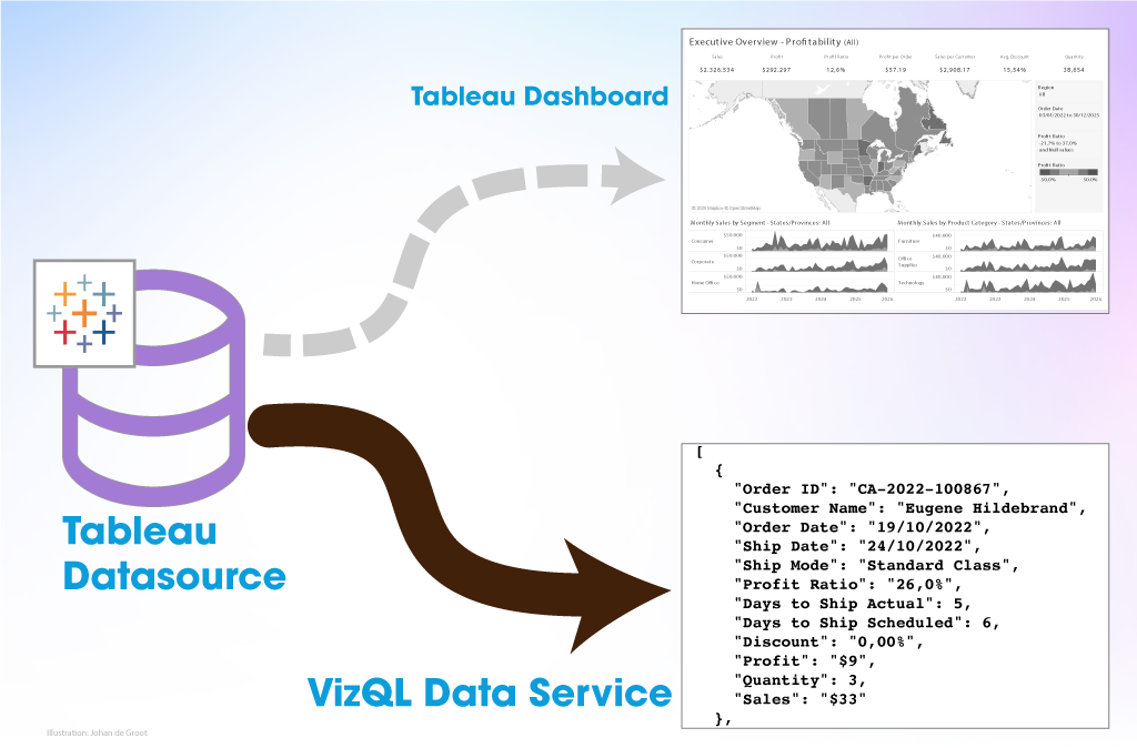
The Tableau VizQL Data Service: What It Is, What It Can Do, and When to Use It
When people think of Tableau, they usually picture dashboards, visualizations, and drag-and-drop analytics. In this traditional setup, users explore data by interacting with dashboards: charts, filters, tooltips, etc. But what if you don’t need the visuals at all—just the data behind them, with all the same calculations, filters, and logic already applied? That’s where the…
Written by
-
Abbreviate long text in Tableau
When working with text data in Tableau, you’ll often need to clean or reshape strings to better fit your analysis or visual presentation. Abbreviating text is a common challenge when designing dashboards, reports, or any interface where space is limited. Whether you’re working with long product names, category labels, or freeform text fields, overly long…
Written by

-
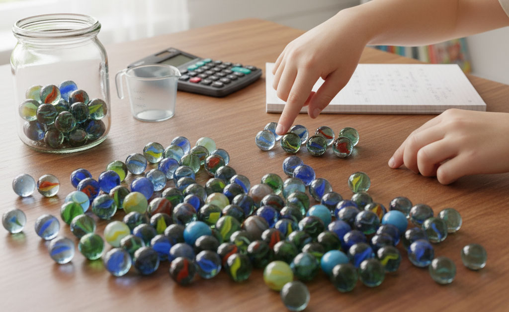
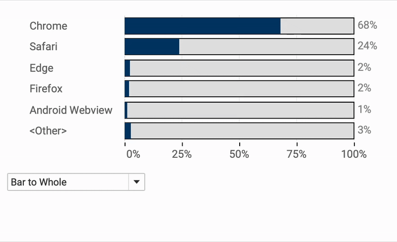
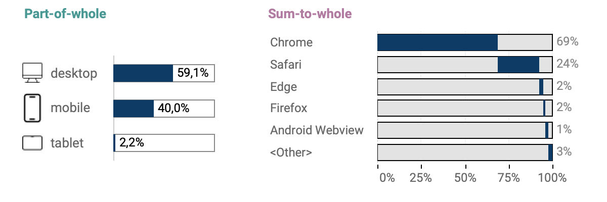
Two Pie Chart Alternatives
Pie charts — they seem to be everywhere. They show up in presentations, reports, and in every stockphoto about business meetings. They’re colorful, round, and look super friendly… but despite being one of the most popular chart types, they’re also one of the most frustrating to actually read.
Written by
-
The Case for Clearer Parameter Labels in Tableau
Parameters are a powerful feature in Tableau — they enable dynamic controls, what-if scenarios, and interactive dashboards. But when it comes to usability, they often fall short, especially in how values are displayed to end users. By default, parameter values are raw numbers, which can be hard to interpret by users. Whether you’re showing date…
Written by
-
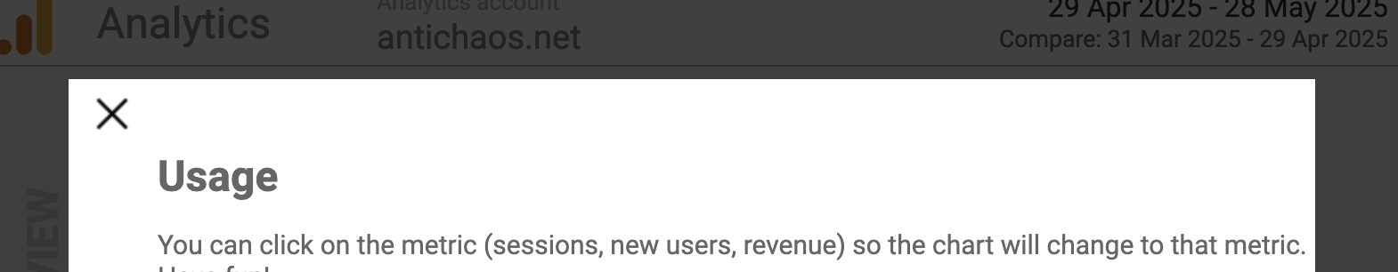
Show/Hide – but better
The default Show/Hide button in Tableau offers a quick way to toggle dashboard elements, but it comes with limitations—especially when dealing with larger components like full-screen visualizations or help panels that can obscure the toggle itself. In this guide, I show a smarter approach using Dynamic Zone Visibility and Parameter Actions. By setting up separate…
Written by