Category: Tableau Calculations

  • Abbreviate long text in Tableau

    When working with text data in Tableau, you’ll often need to clean or reshape strings to better fit your analysis or visual presentation.

    Abbreviating text is a common challenge when designing dashboards, reports, or any interface where space is limited. Whether you’re working with long product names, category labels, or freeform text fields, overly long strings can clutter layout and make visualizations harder to read.
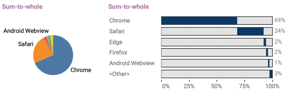
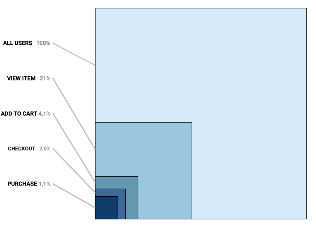
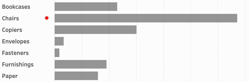
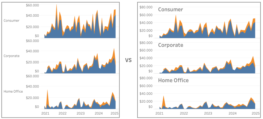
    (more…)
  • Two Pie Chart Alternatives

    Pie charts — they seem to be everywhere. They show up in presentations, reports, and in every stockphoto about business meetings.

    They’re colorful, round, and look super friendly… but despite being one of the most popular chart types, they’re also one of the most frustrating to actually read.

    (more…)
  • Area Funnel chart in Tableau: Visualizing the Drop-Off

    In the world of digital analytics and customer journeys, not every user makes it to the finish line. Some browse a product, others add it to their cart, but only a fraction complete a purchase. Understanding where users drop off—and how many—can offer crucial insights for optimizing your process. That’s where funnel visualizations come in.

    Funnel charts are a powerful way to illustrate step-by-step attrition across a defined process. Whether you’re tracking sales, onboarding, or lead conversions, a funnel view can make complex user behavior immediately digestible. Each stage visually narrows to reflect fewer participants, highlighting friction points and conversion opportunities.

    (more…)
  • Animated icons in Tableau

    An old but very efficient way to point the attention to a row in a table is to add a small text-based icon in front of it. A subtle dot in front of a bar can help you tell the story of data.
    But you might want to use less-subtle ways to highlight data?

    Animation is such a way – and can even add some more fun to a dashboard. In Tableau, this is really easy to accomplish using Image Roles.

    (more…)
  • Improve Titles on Small Multiples

    Small multiples charts (also known as trellis charts or panel charts) are a great way to visualize trends across different categories while maintaining consistency. They display multiple variations of the same chart, often sharing a common axis, which allows for easier comparison across groups.

    While effective, these charts can suffer from poor readability if titles are not thoughtfully applied. Let’s look at some ways to enhance labels for better clarity and user experience.

    (more…)
  • Easier date drop-down in Tableau

    This small tip is on how to add a filter to a dashboard with the current month on top, so it is easier to navigate for users.

    Not one which will drastically change your dashboard, but a ‘quality of life’ usability tip.

    (more…)
  • Drill Down in Tight Spaces

    A different way to make drill down possible/usable in a small sheet.

    Sometimes you don’t have all the space to do what you want.

    Or you are almost finished with a dashboard, and suddenly someone mentions: “Wouldn’t it be nice if we could drill down on this chart…” – but the sheet is just too small for another column. There are multiple ways so solve this issue – each with its own pros and cons. Viz-in tooltip (hard to read on larger drill-downs), hiding nearby sheets (tedious), enlarging the row-height (ugly when not drilled-down), misusing totals (even uglier), …

    In this article I describe a different solution – which definitely has its disadvantages, but can be useful in certain situations where the drill down functionality is important.

    (more…)
  • Deep Cleaning Barcharts – part 2: Punctuated Bar Chart

    [part of the ‘Datafam London 2024 series]

    In part 1 we took a look at a basic bar chart, and ended with the lollypop chart. A fun chart with one major issue: the dot obfuscates the real datapoint.

    Punctuated Bar Chart

    One solution for it the Punctuated Bar Chart:
    We highlight the end of each bar, instead of enlarging the endpoint.

    (more…)
  • Deep Cleaning Barcharts – part 1: the basics

    [part of the ‘Datafam London 2024 series]

    On DataFam 2024 in London I gave a presentation / workshop on deep cleaning dashboards.

    Why cleaning dashboards?

    • Make it look better ▶ Users want to use it
    • Less clutter on your dashboard ▶ Less clutter in your brain
    • Making your dashboard more actionable ▶ Focusing on what’s important.

    Dashboard cleaning is about: Removing, adding , re-arranging, and replacing stuff. In Tableau, it’s about: Table calculations, extra sheets, changing images, talking to users, being critical to yourself, … Is hard work – and a lot of fun!

    (more…)