Category: Formatting

  • Letting Users Choose Their Visual

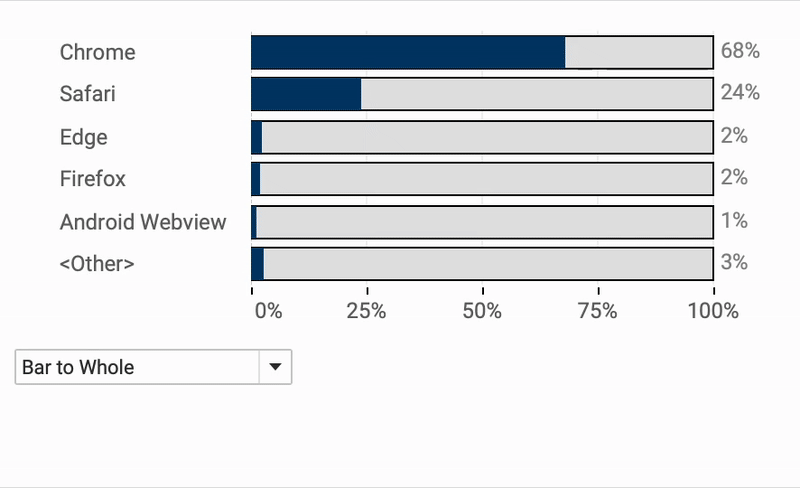
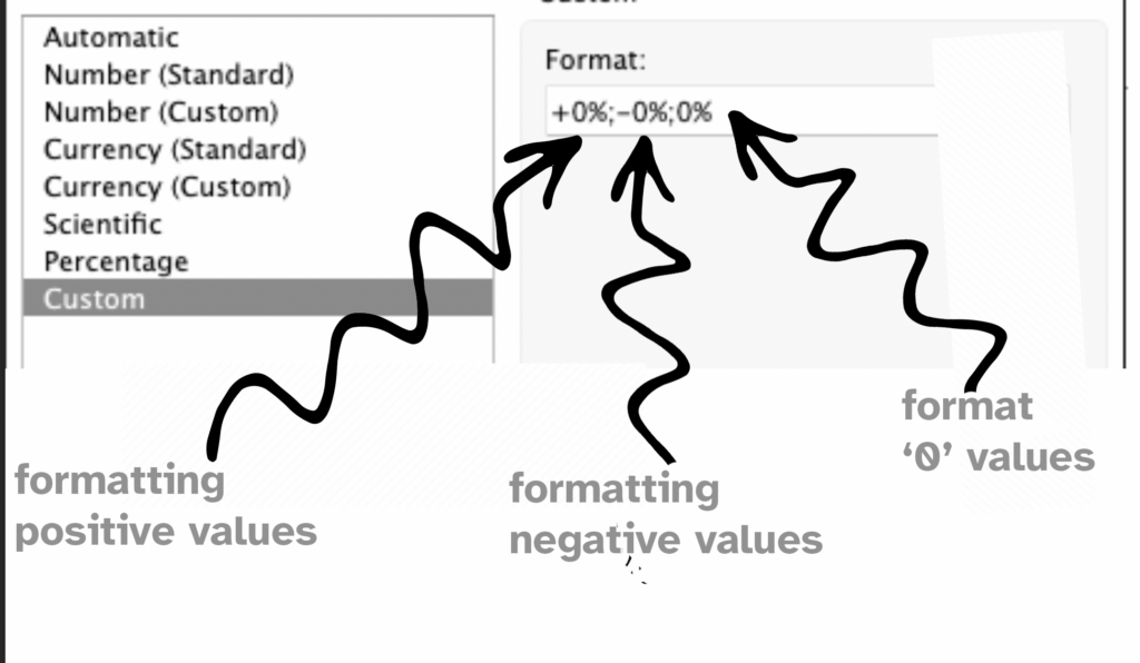
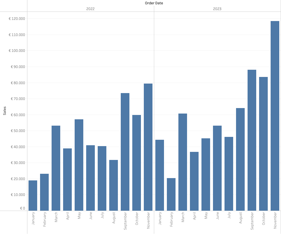
    A powerful way of creating flexible, user-friendly dashboards is by letting your users decide how they want to view the data. Instead of forcing them to view at a certain chart type, you can give them the option to chose between different visualizations- bar charts, line charts, etc, or variations on a chart, based on their need, or preference.

    (more…)
  • The Case for Clearer Parameter Labels in Tableau

    Parameters are a powerful feature in Tableau — they enable dynamic controls, what-if scenarios, and interactive dashboards. But when it comes to usability, they often fall short, especially in how values are displayed to end users.

    By default, parameter values are raw numbers, which can be hard to interpret by users. Whether you’re showing date ranges, filter types, or word lengths, poorly labeled parameters can make a dashboard feel clunky and inaccessible. In this post, I’ll show you a simple way to make a slider-parameter clearer, more intuitive, and more user-friendly.

    (more…)
  • Responsive Labels – Smarter, Cleaner Dashboards

    Data Visualization is about visualizing data the right way.

    Interactive business dashboards tend to have a special challenge: the must display data with accurate labels, regardless of how the data changes from day to day. Many infographics visualizations are using static data – and therefor the labels can be put on the most convenient location. But what happens when the data changes – either due to new data, or filtering? Labels will overlap, disappear, and/or get mixed up.

    The funnel chart is one type of visualization that’s especially prone to this, even with just a few data marks. While working on one, I came up with a solution to keep all the labels nice and clear, no matter what the data throws at it. Bonus: it’s flexible enough for easy customization!

    (more…)
  • Easy Custom Formatting in Tableau

    Formatting matters.
    Inconsistent formatting in your Tableau visualizations can will confuse your audience and make your dashboard look unpolished.

    A well-structured dashboard is not just about the right data—it’s about making that data easy to read and interpret. Inconsistent date formats, poorly formatted numbers, percentages, and currency values can make your insights less clear. Especially in tables.

    In this post, I’ll walk you through essential but simple formatting techniques in Tableau, from setting a default date format to custom number formats. You’ll learn how to hide unnecessary zero values, align text for better readability, and use custom formatting to create intuitive and informative visualizations.

    (more…)
  • Clean your BANs – 3 simple tips

    Three easy to implement tips on BANs: the Big Ass Numbers you put on top of your dashboard.

    BANs are a common and good way to display important figures. But while they are seemingly easy to implement, often they can be improved to make them more effective.

    [part of the ‘Datafam London 2024 – Deepcleaning your dashboard’ series]

    (more…)
  • Improve layout of percentags – Better labels in Tableau

    Improve layout of percentags – Better labels in Tableau

    Often improving a dashboard is about small changes. Have a look a this chart:

    [This blogpost is part of a series tips tricks, as being presented at VizIt Berlin 2023]

    (more…)