Category: Data Visualization
-
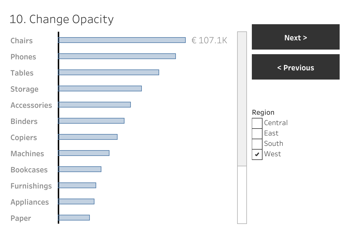
Responsive Labels – Smarter, Cleaner Dashboards
Data Visualization is about visualizing data the right way. Interactive business dashboards tend to have a special challenge: the must display data with accurate labels, regardless of how the data changes from day to day. Many infographics visualizations are using static data – and therefor the labels can be put on the most convenient location.…
Written by
-
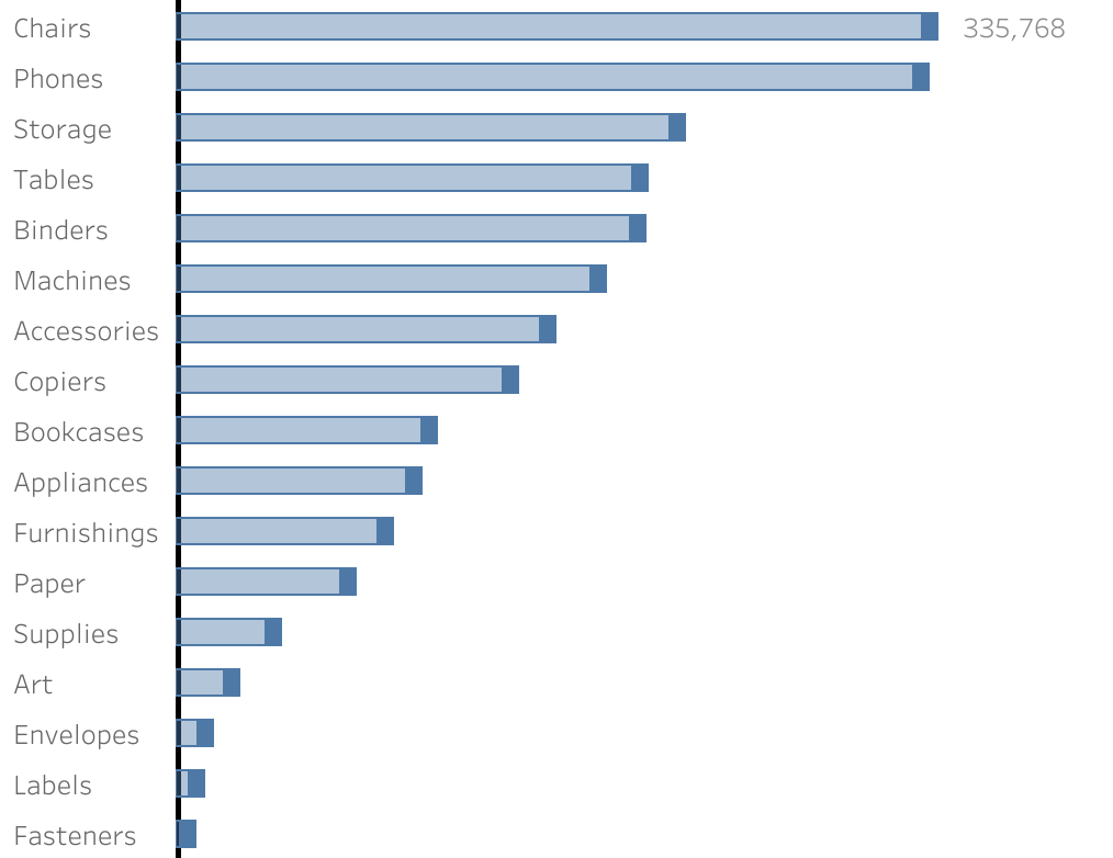
Deep Cleaning Barcharts – part 2: Punctuated Bar Chart
[part of the ‘Datafam London 2024 series] In part 1 we took a look at a basic bar chart, and ended with the lollypop chart. A fun chart with one major issue: the dot obfuscates the real datapoint. Punctuated Bar Chart One solution for it the Punctuated Bar Chart:We highlight the end of each bar,…
Written by
-
Deep Cleaning Barcharts – part 1: the basics
[part of the ‘Datafam London 2024 series] On DataFam 2024 in London I gave a presentation / workshop on deep cleaning dashboards. Why cleaning dashboards? Dashboard cleaning is about: Removing, adding , re-arranging, and replacing stuff. In Tableau, it’s about: Table calculations, extra sheets, changing images, talking to users, being critical to yourself, … Is…
Written by