Category: Data Visualisations
-
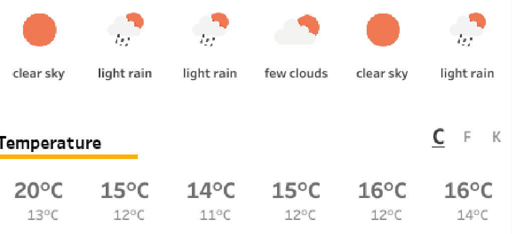
Weather Forecast dashboard in Tableau
It’s just a couple of weeks before TC24 in San Diego… So we want to know what the weather is out there! Or at home. Or any other place in the world. What better than building your own weather forecast in Tableau!?
Written by
-
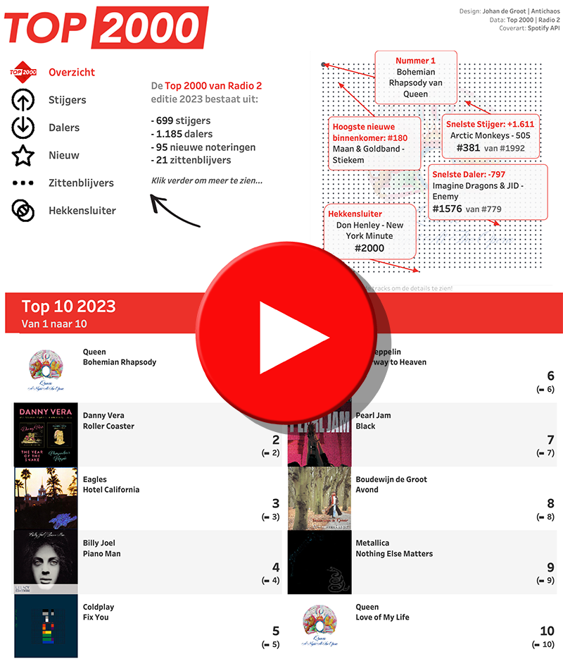
Top 2000 of 2023 – what stood out?
The Top 2000 of Radio 2 (a populair Dutch radio station) has been broadcast for the 25th time – and traditionally I am trying to turn this into a ‘different’ interactive data visualization…
Written by
-
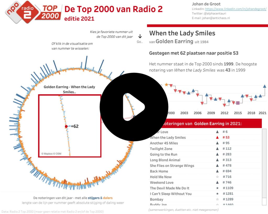
Top 2000 van Radio 2 – Editie 2021
Het is weer die tijd van het jaar – de Visualisatie van de Top 2000 van Radio 2… De Top 2000 zoals uitgezonden door Radio 2 heb ik voor de 10e keer (geloof ik) op een andere manier gevisualiseerd met behulp van Tableau. Dit keer is er gekozen voor een circulaire weergave van de lijst…
Written by
-
Moving Skylines of the World
Showing the Skylines of cities in Tableau – one by one.
Written by
-