Category: blog-en
-
Better datefilters in Tableau
Datefilters are one of the most common filters on any dashboard. They are needed to see trends, make decisions on the right period, and analyse within the right context. But most of the times these filters are not optimal – so let’s make them better (and prettier)
Written by

-
Moving Skylines of the World
Showing the Skylines of cities in Tableau – one by one.
Written by
-
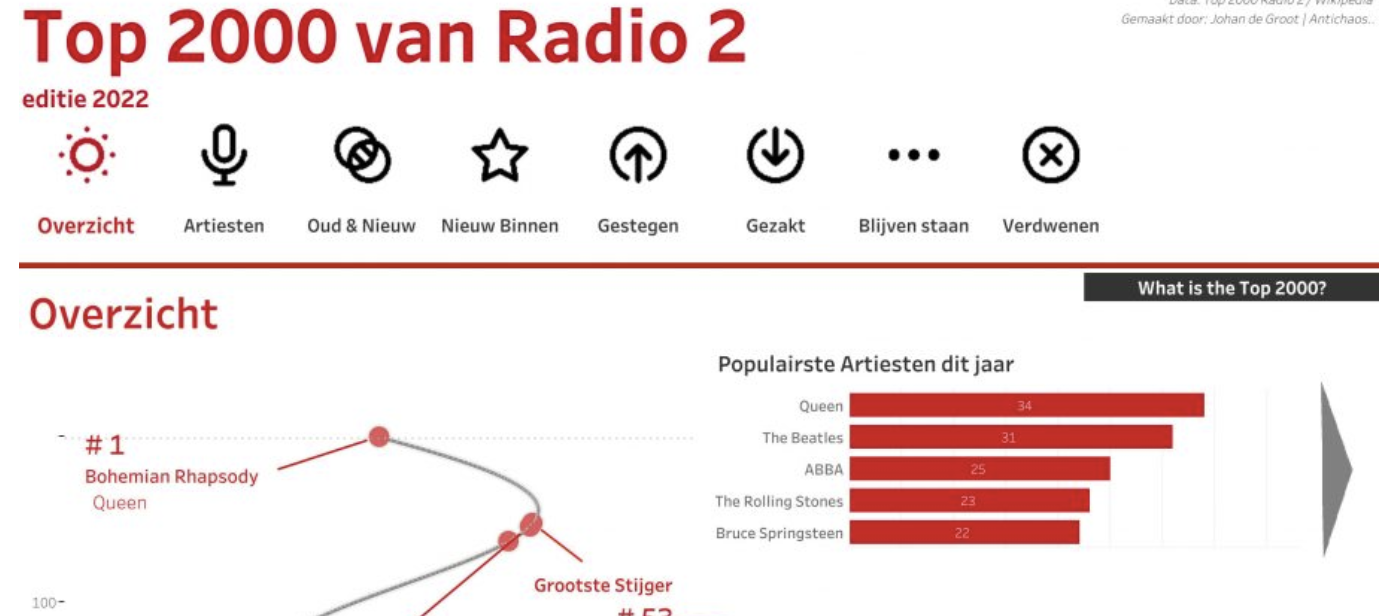
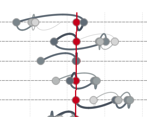
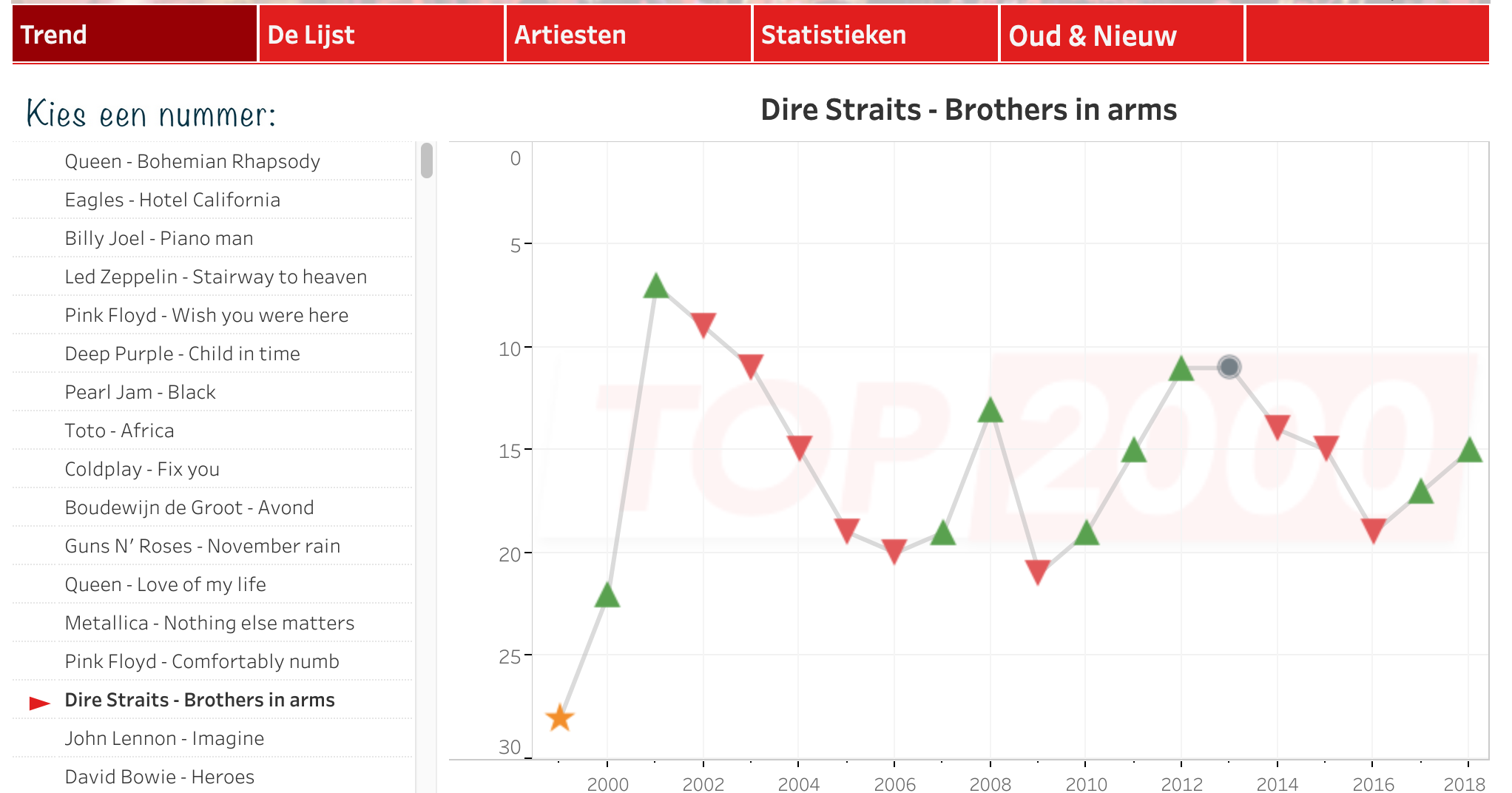
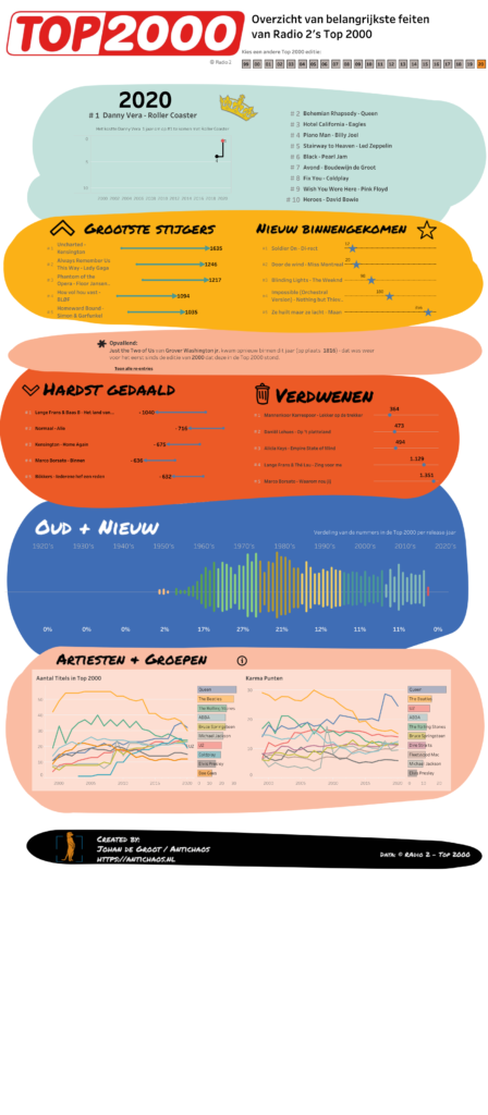
Top 2000 visualisation – edition 2020
The Top 2000 edition of 2020 isn’t a fancy data visualisation with extensive data-preparation and/or mathematical formulas like last year, but a visualisation with the emphasis on what you can do with relative simple graphical elements. This approach can change the look and feel of a ‘standard’ dashboards significantly Click on the screenshot to view…
Written by
-
Top 2000 visualisatie – editie 2020
(In Dutch) Voor de editie van 2020 heb ik dit keer niet gekozen voor een extreem fancy datavisualisatie met uitgebreide data-preparatie en/of ingewikkelde wiskundige formules, maar wat meer nadruk gelegd over hoe je met relatief eenvoudige grafische elementen je een dashboard een compleet ander uiterlijk kunt geven dan een ‘standaard’ dashboard.
Written by
-
Use Python as an Alteryx connector
Many people are kind of scared of using programming language. And sure, if you haven’t any experience using these ‘command line’ tools the learning curve may seem steep. And why should you learn a language like Python, if you have a fantastic tool like Alteryx to process your data?
Written by