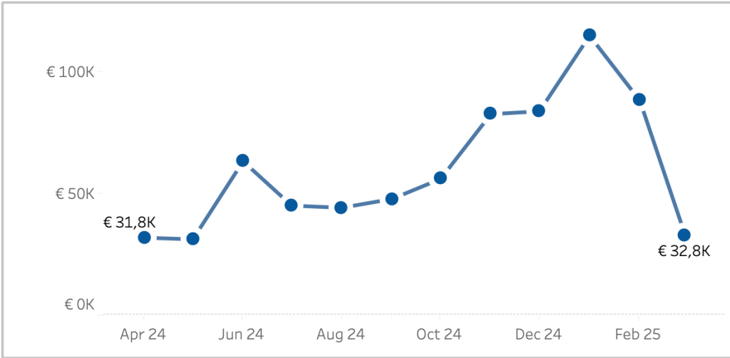
Sometime you want to make a dramatic statement – and sometimes you just need a little nudge to help users understand a dashboard.
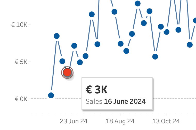
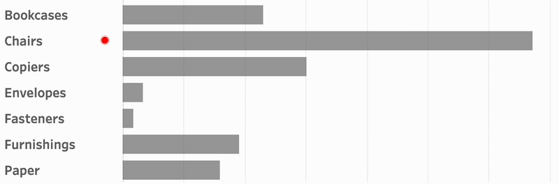
Tableau makes it really easy to create a minimalist dashboard – and tooltips are a great way to unlock the data behind a mark. Emphasizing the datapoint of the tooltip will make the visualization just a little better. And this is even more important on charts with multiple lines.
(more…)